Responsive Web Design
Responsive design should no longer be hard.
I am finally (nearly) happy with the design of this site and how it responds on different devices. It has taken a lot of tinkering, but thankfully there are now (free!) tools that can help.
When I designed my first web page there was no such thing as media queries. Back in those days a mobile phone was very advanced if it supported WAP. I can’t remember exactly when I made my first site, but the Wayback Machine has a snapshot of it from as far back as May 2001, and going by the amount of content it must have been live for quite a while before that. I remember building parts of it in some WYSIWYG tool that had came with my Mac (I believe this was Adobe PageMill 3.0). After seeing how inflexible it was (never mind the horrid markup it produced) it was never to be touched again. Even at the point of the final revision of the skating site I ran for years, the only device specific styles that were available were for differentiating between just screen and print. I never implemented any variation as the rich media content the site was almost entirely made up of did not require a separate set of print styles. The features available now, and what users expect, has completely changed. Users just expect a site to remain usable no matter what device they are using. I certainly find it very annoying, and will not persevere, if it is not usable on my phone.
As I’ve been trying to re-learn CSS & LESS, a lot of tinkering has been required to get this site to appear as I want it to. (Saying that, the design has gradually evolved and has taken a form quite different from the initial sketches I made as part of the design). It has been a process of nearly completely relearning everything about CSS, as in my past experience hacking around quirks in IE 5 for Mac needed to be considered. Now, I am only considering modern browsers and happy to accept graceful degradation for older browsers. The site has been skim tested using IE 8, I am using html5shiv to force older versions of IE to understand the HTML5 element tags such as <section>. When designing this site for the desktop the Chrome DevTools have been a huge help. These tools allowed me to tinker with the CSS live, then when an element was appearing as I wanted to I would just update the source LESS file to match my changes.
Making the Site Responsive
As I use LESS for generating CSS, many common design elements I use were already set up as Mixins which could be resized by parameters. In order to make the whole site responsive I just extended this idea, I have split out any elements of the CSS that are size related into a Mixin that takes a few parameters for the base font size, width percentage, heading size ratios etc. This Mixin is then used in each of the different additional media queries I have chosen to support (iPhone and iPad sizes only just now). These media queries use the max-device-width selector, which did the job, but it was difficult to work out where stray borders were appearing from.
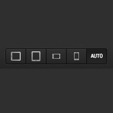
In order to debug the site, I added in identical media queries that use the max-width selector. This meant that I could use the Chrome DevTools to debug the site. To avoid having to resize the window to meet the media query rules, I used the Responsive Design Bookmarklet by Victor Coulon. I first became aware of this after it was a pick in Systematic 52. This bookmarklet provides 5 buttons at the top of the browser window for iPhone and iPad dimensions (both orientations), as well as Auto which just uses the current browser window size. While this nearly exactly mimics the mobile experience, I did have some outstanding issues caused by the fixed header and how the address bar behaves in Chrome for the iPhone.

Printing
For the majority of the site I am not overly concerned how it appears when printed. The only section of the site I wanted to pay special attention to the print format to was my Résumé, as it may be needed when I decide it is time to move on. I thought debugging this would be a nightmare, but it turns out the Chrome DevTools can spoof the media type. It is not obviously placed, but clicking this little cog opens up the DevTools settings.

In the “Overrides” section there is an “Emulate CSS media” option which can be used to change to the print styles, and for device metrics I used 595x842 for A4. It would be nice if this had preset page sizes when the “Print” option was in use.

To summarize, the Chrome DevTools have been incredibly useful in getting the CSS styling of this site look decent while I am still getting up to speed with CSS again.
Next?
I expect the current layout of this site to remain fairly constant over the near future, with only minor layout issues being fixed. Today I was addressing a couple of issues that appeared when viewing the site on IE 8 (my XP VM is slow as treacle). I have a backlog of partially written posts that have been placed aside and really should be published before the chain of thought behind them is completely forgotten. One of these is still very fresh in my mind and (as it is workflow related) just keeps growing the longer I put off publishing it. I am quite proud of the related content that will be distributed with it. I have also been working on another site as a side project, but now I that I have an understanding of how to achieve a responsive design from working on this site it will need to be revisited.